A compilation of random and interesting things, musings, musics, videos, and more. Brought to you by a UChicago student with a penchant for procrastination.

Thursday, April 26, 2007

Robots Like Us

I always enjoy a good trip to the museum, and while New York was rife with fun museum-hopping material, it was the chance to visit the Museum of Science and Industry in Chicago again a couple of Sundays ago that I found really great. I'd gone to the museum several times before, and while this time around I got a chance to see the surreal but utterly amazing Body Worlds 2 exhibit, there are certain permanent exhibits that never cease to amuse me.

So if you haven't yet visited the museum or are hoping to discover something fun on your next visit I'd definitely recommend the Robots Like Us exhibit. The vintage robots and robot-like creations it showcases really are the cream of the crop and make my design sensibilities all a-flutter.


Not only does this exhibit have a really wide collection of robots and space toys from the mid-twentieth century, it takes pride in the sci-fi culture that has since sprung up. The collection is interspersed by interesting focal pieces that definitely provide some true nerd-fodder. About halfway through the exhibit you can find a functioning theremin, a rather strange musical instrument used to produce the kooky sound effects of early sci-fi flicks (but mainly exploited by kids who loved getting it to produce the longest and shrillest possible screech). Other pieces include throwbacks to sci-fi shows and movies, with everything from the Daleks of Dr. Who, Rosie from the Jetsons, and a large Sentinel sculpture from The Matrix at the very end of the exhibit.

However, the toy collection really is the big attraction for me. With more than 200 pieces from the 'golden age' of robots, it showcases some of the most interesting toys to be produced during this time. Though I can't say how many of these were of Japanese origin (which also had a marked robot renaissance during this time) the pieces presented were definitely varied enough to satiate most individuals.


Here are some of my favorite robot characters from the exhibit, chosen for their quirkiness and overall vintage aesthetic. I don't know that they could've competed with the little plastic wind-up robot I had as a kid, but in all reality, who could resist their quirky charm?


Mr. Sandman is the ultimate transformer:
apparently he can be deconstructed for use as a pail, shovel, and watering can.
It's a good thing he doesn't have any wiring though!


This little guy definitely represented the big themes of this time period,
robots, outer space, and a love of tin ... delicious, delicious tin.


Two words: KROME DOME!


Remote controlled toys first got their start in this period, so its refreshing to see that they began to adopt so many interesting iterations.
Robot-space-drummer-boy? Sure!


The packaging was displayed separately from the toys in cases that were further down in the exhibit, yet these were just as interesting to look at - especially with the art style that made this time period distinctive. Fear the Mighty Robot, in all of its panic-stricken glory!


These robots all look so industrious ... although, I don't yet know what possible practical use robot "LAZOR-vision" might possess. Oh, Japan ...


Finally, the most amazing robot of the bunch.
ROBOT-BATMAN
... I'm somewhat confused though, if he's Batman (The Dark Knight of Gotham city) and a robot (so clearly he must posses some robot powers) then why in the world would he need to carry a gun? That is what's in his right hand? Right?

I hope this has given you a taste for how amazing this exhibit is and the Museum of Science and Industry can be. Also, if you have any further interest in looking into the culture and design that made this period of toy production so exciting I'd definitely recommend checking out some of the great robot books published on the subject:

Super #1 Robot: Japanese Robot Toys, 1972-1982 by Tim Brisko

Robots: Spaceships & Other Tin Toys by Yukio Shimizu

Blast Off! Rockets, Robots, Ray Guns, and Rarities from the Golden Age of Space Toys by S. Mark Young, Steve Duin, Mike Richardson, and Harlan Ellison

Labels: , , , ,

Saturday, April 21, 2007

The Target Dollar Spot

I haven't been at my local Target in a while, yet whenever I get a chance to go to one it really is a festive occasion - especially if it's a Super Target. The reason I bring this up is simply because I feel the need to voice how utterly amazing I find the 'Dollar Spot' section of Target to be. While for the most part the store remains one of the best around for really cheap food stuff and shoes, without getting the Walmart stigma attached to it, the one dollar section really puts it over the top as one of the best supermakets/department stores around. And ... well, I have to admit, I guess I'm a bit enamored by it.

As you walk in the door and are greeted by the red - everywhere - the dollar section is right there, beckoning you to it with the promise of really cheap and completely random objects. I think the fact that you never know what to expect is really one of the biggest draws for me. Well, alright ... you know you can find seasonal objects there - like Easter rabbit ears or little stocking stuffers. But the completely random knicknacks, gadgets, or whatsits are truly what its all about!

Case in point: wind-up, head-bobbing, tail-waggling triceratops. Both absurdly painted, both completely random, both exotic Chinese creations ... yet only ONE dollar!


I call this one Pinky.

But yes, while I may be easily amused by these toys and drawn into purchasing things I may not necessarily need - there can be practical finds in the dollar section as well! For that I turn you attention to the 50 cent "toy" toaster, with pop-uppable plastic toast. While its hard to image this having any sort of use beyond simply popping toast over and over ... and over again for my sole amusement, it does make remarkable holder for my iPod video! Seriously, this may very well be one of the most perfect and completely original iPod solutions, but hey - if you've found something weirder or more inventive than this - let me know.


Aaah yea - getting some toaster-Video iPod-the Office action


But indeed, I'm beginning to think that Target is seeing the potential for expanding its line of completely useless objects even outside the dollar section of the store. Sure plastic toasters and wind-up triceratops-es are one thing, but while walking through the 'seasonal' section of the store just this past week I began to notice a preponderance of completely random looking objects - which, while seemingly having a practical purpose, were overwhelmingly of the same mettle as the design-heavy knick-knacks I had come to love in the dollar spot.


I really was caught quite offguard when I happened upon these "Owlford Owl" watering cans. Yet apparently they're just one part of Target's plans to further a unique and fun aesthetic, which individuals like myself can't get enough of.

"Summer is a fun and exciting time and Target believes the theme of ‘Happy Summer’ truly captures the spirit of the season,” said Gina Sprenger, senior vice president, merchandising, Target. “The collection offers guests easy and affordable ways to decorate and celebrate in style this summer season.” [Target press release, 2007]


Designed by David Kirk, the illustrator and creator of such children's classics as Miss Spider I'm glad to see these fun products appearing in more mainstream areas and appealing to greater numbers of consumers. Although ultimately, I guess it made sense then that these items were primarily being marketed under the SunnyPatch kids collection ... but really, Target - I would have seriously considered purchasing a pair of owl garden boots if the price was right ... and they actually came in sizes larger than children's. Think about it! I know I haven't!

All in all then, I guess I've given voice to this persistent affliction of mine. It's no wonder I'm so drawn in by garage sales and Chinatown - but now Target too is helping to further this fond habit of mine. And while I should probably be condemning them for this, with some last remnant of my reasonable mind ... I can't ... Target, thank you for the Dollar Spot and your random design aesthetic!

Labels: , , ,

Monday, April 16, 2007

Designer Paper Craft

As a person who views Kidrobot as her own personal paradise, you can be sure that I've followed the development of the designer toy and vinyl art scene for a while now. I'm continually inspired by the wealth of amazing designs and whimsical, anthropomorphized characters which have transitioned from an urban medium and embraced this amazingly flexible new format.

With the market for such inventive, highly-collectible designer toys burgeoning it's not difficult to see why this design sensibility now encompasses vinyl figurines, plush toys, collectible capsule trinkets, and all manner of accessories. By targeting an older, design-saavy, yet inherently 'hip' demographic (who are at their core nostalgic for their old toys) these limited-release creations have claimed a sizable following. Online stores and boutiques in major cosmopolitan centers have begun to tailor to this growing trend and the prevalence of this design is consistently growing.


Yet the collectors are only one part of this subculture. Toy and figurine creation is proving to be an outlet for designers of all kinds, from those with a reputation in street art to seasoned artists like Gary Baseman (an illustrator you're probably familiar with). The general ease with which vinyl can be transformed into a limited edition creation, combined with the amazing response that it engenders has drawn in a wide gamut of designers who constantly push the boundaries of design.

In the spirit of the vinyl toy then, it is not surprising to see designers taking their creations into other mediums. Recently, I've begun to notice more and more instances of paper art around the web. With the ability to be freely distributed and very easily produced this newest wave of design is definitely gaining ground. What's more, this new format is helping to introduce even more individuals to this creative design realm.

Being one to adorn my desk and shelf space with all sorts of knick-knacks, this consistent introduction of great new paper creations is something I'm really excited about. What better than a completely unique and free paper kraft could there be to make one excited about design and its creation.

While websites and blogs like Paperkraft and Paper Forest have sprung up to document the newest introductions to this field, I figured I would include some of my favorites below.

Toypaper.co.uk is a recent website with a sleek Flash interface. As you parouse the various design categories you'll find a wide variety of fun pre-made and customizable paper monsters and series. With a photo, description, difficulty level and link to pdf download - it couldn't be easier to print and create your own desk buddy.


Readymech.com is a side project of Fwis, a graphic design group in Portland, Denver, Cupertino and Brooklyn. With an ever growing number of design series, Fwis enlists the help of various designers to create the sundry creatures that make up the readymech family. Again, the presentation remains very straightforward and you'll be sure to find a paper creature to suit your tastes. I for one love the four-armed Tenaclopse!


Loulou Illustrations features a number of really fun and colorful images, yet the shop transforms them into a selection of paper figures that are worth your time. While the badminton enthusiast (below) was the one that really caught my eye, there are a couple of other amusing designs including robots and a surfer - good times.


I knew I couldn't get anywhere without including this most amazing paper tribute to one of the best games of all time, Katamari Damacy. So while I have no idea how to even begin to decipher the Japanese characters all over this page -- that is indeed where you can find your very own Katamari prince paper figurine! As quite possibly the best paper kraft toy here, why not make your own to enlighten you in the ways of the katamari?


Found on Flickr, where it was created by the user buding, this is definitely a very close follow up to the Katamari prince. With a similar style and innate quirkiness, the Rabbit-man can easily become the stalwart defender of cool wherever you place him.


And finally, because Flickr really is the perfect resource for this sort of thing - groups like Paper Designer Toy and photo sets like PAPER TOY show off some of the best designs out there. The two of these are rather closely associated with Paper Possible and 100% Loading, which appears to be one of the larger groups through which designers have showcased their paper art. Check these out if you're interested in seeing some of the best custom paper designs out there - though, they unforunatley don't offer too much with regard to reproductions.


So with all of this inspiration I know I'll probably spend way more time than I should trying to put together paper creatures instead of writing my essays ... but who could resist? I'll definitely try to document their creation if I do or, if you feel inclined to make your own - let me know about it in the comments.

Labels: , ,

Tuesday, April 10, 2007

Altoids: Curious Advertising

When I was in New York City last month (and walking pretty much everywhere for four days straight) my camera and I happened upon a couple of instances of clever, but seemingly unassuming Altoids advertising.

Careful, It's a trap.

Sure it wasn't some new fangled viral marketing or anything, but the minimal approach to the ads - a nice clean design paired with a witty phrase - was enough for me to get out my camera and take a photo. There was something about the subtle way Altoids managed to sneak a bit of humor or radomness in, without making it something absurd or over the top, that really appealed to me.


Well, after being pulled in by this minimalistic but effective approach to their posted adverts I really was 'curious' to learn more (har har). Apparently after making an appearance on Valentine's day (with a jab at sentimentality) this follow up series of street advertisements was meant to further awareness of the new "curiously chocolate" Altoids. Chocolate you say? Well, after seeing the success of their usual peppermint, cinnamon, and ginger flavors what natural progression was left but to dip them in dark chocolate!


(image originally posted on candyaddict.com)

While my initial reaction to this news was of ... well, puzzlement. I do have to confess that other combinations which I had previously been skeptical of - chocolate covered pretzels, for instance - have fast become some of my favorite food hybrids. So, curious combination aside, it seems Altoids genuinely has something special on its hands. While I'm yet to pick up a box of these choco-mints, others have taken the liberty of reviewing the different flavors, which apparently are pretty good!

Plus it seems Altoids not only has this clever series of paper ads, but also a number of quirky commercials that play with the notion of consumer's initial surprise at seeing this hybrid. Truly, if you couldn't think of anything more bizarre than chocolate covered mints these commercials provide some close alternatives.


Banana-Hands Allen


Half-Deer Edwards

Produced Biscuit filmworks under Leo Burnett-Chicago and directed by Tim Godsall, the series of four commercials definitely continue the vein of weird, yet humorous ads that have come to define the Altoids brand. The two spots I posted above were definitely the ones I enjoyed the most, but if you want to see them all there's also Blow-Hole Bob and the Australian Double-Back - but I'll leave these up to your discretion.

While I'm not sure that these commercials can top my love of the ad-sense portrayed by the Skittles brand, the similar vein of quirky humor and that mix of surreality with the sense of mundane definitely brings them to the top of my list.

Now I just need to get my hands on some of these buggers -- why in the world must the deer men hoard them so? If you've tried these already let me know where I can find them, and what flavor you'd recommend. Otherwise, let me know which Altoids spot you enjoyed the most!


Labels: , , , , , ,

Sunday, April 8, 2007

Happy Easter

Easter has always been a holiday I have somewhat mixed feelings about. While the religious aspect of this time certainly has some significant personal weight at its forefront, I believe the moral dilemma it brings to other things ... namely Marshmallow Peeps, is not to be overlooked!

I've always loved eating Peeps - from munching down on their plump marshmallowy forms to enjoying that fine, yellow sugar that always sticks to your fingers or is leftover at the bottom of a finished box, making the whole endeavor so finger licking good. Besides, knowing you can use the microwave to blow Peeps up to massive proportions before they implode upon themselves, can even be justified as a creative act - pulling in kids (and college students) on their 3rd or 4th box as the prospect of merely decapitating them starts to wear off in novelty.

Yet, as with Teddy Grahams and Gummi Bears (perhaps too those Goldfish crackers that "smile back") there is always an element of sadistic cruelty in taking pleasure from chomping down on these gentle, marshmallow-based creatures. Usually I have no qualms about this ... but this year, I got an especially heart-wrenching box!


That's because this year my final box contained Peeps whose weepy chocolatey eyes implored me not to eat them! I realize this is simply a side effect of the mechanization of the Peep creation, yet adding this emotional level to my Easter sweets is not only uncalled for ... it makes me feel like a monster!

Don't cry little Peep!

You may have won this time sentimental-attachment-to-deliciously-defenseless-sugar-species, but just you wait until I get my hands on those marshmallow ghosts, they're already "dead" hence, no remorse! I suppose for the time being I'll just stick to my stash of Cadbury Creme Eggs and assorted Polish candies - oh, how I love the guilt free sugar trip that is the holiday season!

Also, if you want to see more photos of Peeps in and out their natural environment I highly recommend checking out the Peeps flickr group: Peeps-tastic! Featuring photos like the one below, which just made me crack up!


Labels: , ,

Saturday, April 7, 2007

Written On The City

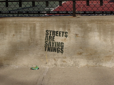
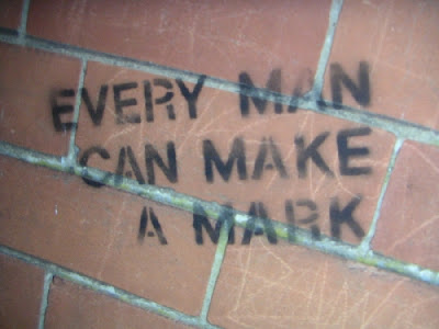
I've always been a fan of street art in the sense that it introduces an element of the unexpected into a seemingly formulaic arrangement of the streets, addresses, and buildings that form a city. The presence of stickers on the back of a no parking sign or a cleverly placed tag on a street corner, in essence, evokes for me the life of the city and helps in some ways express how the core element of the city - the people living there - interact with their environment and leave their mark. The streets really do then begin to say things, given life by the people who interact with them on a daily basis, and forming the character that others perceive when visiting a city.


That's why Written on the City, a website devoted to the phrases and words of the city environment, was such a great find for me. Clicking through the entries for the various cities around the globe brought me closer to understanding the sentiments and random musings which individuals have expressed through the street medium.

The
about page, describes this sentiment perfectly ---

someone is trying to tell you something.

they don't know you, and it doesn't matter. they say it anyway, writing on the city itself, because the message is important.

and so we're listening.

what's your city saying?

If you have a chance click through some of the entries or explore entire cities, it really is a fun way to spend some time. Otherwise, here are some of my favorite entries, both thought provoking and otherwise random *

Ashbourne, UK

San Francisco, California, USA

New York City, New York

Arnhem, The Netherlands

San Francisco, California, USA

* Clicking on a photo should take you to the original page. Once there you can find further information about location, photo, and photographer - as well as the option to comment on the work!

Labels: , ,

Friday, April 6, 2007

Head On

While I might have considered this during the sophomoric youth of my career as a blogger, this post is ultimately NOT meant to reference to that amazingly annoying series of commercials you've come to hate to see in the middle of your Jeopardy broadcast.

"HeadOn® apply directly to the forehead!"

Though I have to admit that when repeated ad infinitum this slogan becomes just about as catchy a screwdriver boring into your skull - it is has to some extent come to define the commercial genre. Sure its incessant slogan may fuel a horrid headache, but - gasp - what sole product must you then rely on to cure that headache? Why, none other than HeadOn!

Curses! I've succumbed to their ploy!

Rather than dwelling on this realization of a commercial conspiracy, however, I wish to direct you to an amazing work of modern art that I've been mesmerized by for a while now.

Head On by Cai Guo-Qiang

Currently an installation in the Deutsche Guggenheim in Berlin, Germany this work utilizes 99 life-sized replicas of wolves in its creation of the completely surreal scene. I can only imagine how astounding this work must be to see in person, yet even these photographs (taken by Ihara and Mathias Schormann) shed light upon the amazing intensity of the work.

With few wolves scattered in the front gallery, all ninety-nine wolves run, gallop, and jump toward the far end of the exhibition hall, where a wall stands. The bravery of the wolves is met head on by the unyielding wall. As the leading wolves go down, many more follow with force and determination. As those in the front fall and pile up, those behind take up their positions. [Concept description]

While the work initially piques my interest for its scale and unorthodox presentation, the real message behind this installation can be applied to a deeper view of any ideological struggle faced with an insurmountable barrier. The relentless push exerted towards a goal beyond the glass, even when unexpectedly cut short, really exemplifies the strength of will with which people can be mobilized and moved in such great numbers to act. What are seemingly solitary animals, the wolves thus, take on a form beyond their individual selves and the force of their vast unified action - even when ultimately unsuccessful - still leaves a lasting impression in its wake.


To see the other works of artist Cai Guo-Qiang I highly recommend visiting his website.

Two of his most recent 2006 works have also become favorites of mine -
Inopportune: Stage Two, which arranges tiger figures in further unexpected positions as well as Clear Sky Black Cloud, which hints at his amazing work with smoke and explosives really speak volumes to the skill of this artist.

If you find a work of his that speaks volumes to your personal taste, feel free to leave a comment!

Labels: , , ,

Wednesday, April 4, 2007

Let's Explore the Airport

I know that for some people flying isn't a big deal. But I have to admit that ever since I was little the airport has held a certain magical appeal for me - perhaps it was all those hours of playing "Let's Explore the Airport" with Buzzy the Knowledge Bug in elementary school ... and I kid you not, that was the actual title! But really, there is just a certain magical charm to knowing that this specialized building facilitates the hurtling of you and your possessions through high altitudes in a winged metal tube - a charming vision of flight indeed.

Well, like Buzzy, I guess I too want to share my fascination with the whole process of commercialized aviation. Having flow internationally only twice before, taking an American Airlines flight round trip between ORD and LGA was pretty exciting time for me. It's no wonder then that I arrived at the airport carrying-on my very own American Airlines t-shirt, which I had bought at Wal-Mart just the day before for it's prominent use of eagle (see Colbert Report).

Eneagled!

Well, let me tell you, the American Airlines experience at the O'Hare International airport involved way more than just slightly disturbing cross-promotional apparel. After acquiring my boarding pass via one of those neat check-in stations and passing a the prerequisite security checkpoint the marvels of the airport were open to me! Overpriced literature, noisy food courts, and bustling travelers all called to me ... yet, something was missing ... sure the interactive weather and news display was there, but after meandering the length of the terminal, each further step reverberating the sound of my sad realization, I had to face the truth - there were simply no moving walkways in this section of the airport.

Next to escalators and self-opening doors, the moving walkway represents for me one of the marvels in modern convenience. Why exert yourself unnecessarily if technology provides a simplified solution? After all, the whole of our modern society is framed around this principle, with everything from computers to the popularized notion of an 'easy button.'

Alas then, it was with sad resignation that I returned to my boarding area, knowing that I could not in fact pay tribute my favorite ambient/electronic airport fusion inspired work (and no, I'm not referring to Brian Eno or his pretentious Music for Airports!).


Ah, Royksopp - how perfectly your mellow beats frame the irony of my plight. For all of the American Airline terminal's technological innovation: cavemen can ride the dream of the future, but I cannot!

Fortunately though, this sad state did not linger for too long (it clearly only expresses itself periodically in the form of these rants, er, posts). As the plane boarded and the prospect of flight elevated my spirits, the crowning shining pinnacle'd zenith of my aviation endeavor finally revealed itself! As the sound system crackled into life, the safety demonstration began ...


For this I salute you, flight stewards and stewardesses of the world!

Like an interpretive dance heralding the birth of creativity - the lethargic and seemingly asexual forms of the flight attendants came into motion. Prompted by colorful props and whimsical gestures the story of aviation safety came to life! The struggle for survival, for well-being and safety had never before been presented in such an enthralling fashion. With all of the excitement I finally understood the true dedication that must've been exerted by the attendants to maintain a listless and bored look on their faces. Even I, at the edge of my seat, suppressed the urge to jump and laud them with praise - masking it instead with a disinterested rifling through an in-flight magazine. This was thus, perhaps one of greatest performances of our time, each and every passenger and crew member playing the role of 'indifferent person' without even a the single hint at their deeply focused character acting. I was floored, at a loss for words - but of course, outwardly, I was just glancing over the safety brochure.

With the dazzling spectacle of this preflight ritual over, it was fun to look over what the safety instruction manual had to offer. With a radical departure from the forms common to Ikea instructional booklets or the traditional 'generic passenger' clip-art in airplane publications - the manual I held in my hands portrayed real people ... from the bygone era of what I would assume was the early 90s.


After being trapped for more than a decade on the pages of their staged emergency situations, these people had developed some amazing abilities. Not only were they able to levitate down inflated slides (as if by magic!), but the one woman in blue clearly manifests an ability to manipulate time and space itself. While she's initially depicted pushing the main in the heinous horizontally striped shirt down the slide in the middle frame, the last frame show her already off of the slide and behind the man in the heinous vertically striped shirt!


For this to have been possible, she (A) would have somehow had to get ahead of the guy she had just propelled into the air (B) and gotten on the ground (a) before he had even finished sliding (b), ergo magical powers! Note, the magical circles drawn around here are there to facilitate the effect *

I know, perhaps I'm desperate for Heroes to come back from hiatus ... but in all honesty, before anyone can say a word she'll probably have whisked off into the non-existent landscape, never to be heard from again ... except perhaps when she mysteriously turns up at another emergency landing! Coincidence? I think not. Perhaps Homeland Security should be tracking down subversive elements like her instead of just letting her parouse through our defined notions of scene continuity (Hmpf)

But for all of the inherent insanity of this image, I'm thankfully not the only one who thinks these safety manuals are weird. In fact there are some hilariously appropriate captions added to other airplane manuals via Airtoons. What's more even the Fight Club idea for a 'realistic' emergency leaflet has been realized!

Honestly, if you're going to have one satisfying experience at the airport, it's not taking the experience with such passivity or annoyance - instead enjoy it! Take advantage of the time when your flight it delayed to muse over the implications of time travel or let your mind wander towards randomness as you engage in your own rituals of bag identification or the ever skilled dance of the fallen-asleep leg. Have fun with it!

Labels: , , , , ,